Introduction
Validating a product on the market today is complex and expensive.
When you can’t afford to beta test a product or dump thousands of dollars into development, you need a way to test the market and make sure that people will buy it.
Creating a product without demand is a recipe for disaster in the ecommerce (or business) world.
It means you could be risking your hard-earned money on a product that won’t sell.
But validation isn’t easy to get. And most of the time (if not all of the time), the first company to jump on a trend will take off.
And that’s exactly what happened for Taron Lizagub of KNOXLABS.
Taron had no product in development and no means of creating it yet.
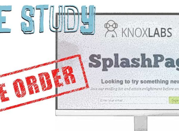
Instead, he tested the idea using a simple splash page to gauge user interest and offer pre-orders of a soon-to-be product.
When he used this method, he landed over 500 pre-orders and noticed huge influxes of traffic and interest in his idea.
Without any money spent on development, he was able to validate his idea and produce a business built on success.
He’s now generating millions of dollars in revenue every single year.
So, how can you make a splash page to validate your product without spending a dime on development or beta testing?
Thankfully, Taron laid down a road map for us to follow.
Here’s some background on what a splash page is, how KNOXLABS used it to secure 500 pre-orders before they even made the product, and how you can validate your product with one too.
What is a splash page and how does it work?
A splash page is different than a typical page on your website or ecommerce shop.
Most people get splash pages confused with landing pages, but they are different tools entirely.
Landing pages are pages that a user lands on immediately after being prompted with a call to action or offer.
Splash pages, on the other hand, are designed to streamline the user experience by providing valuable data before a user has access to your site.
A splash page could come in the form of a welcome screen, a teaser, or a trailer video. It precedes any page on your website.
Unlike a landing page, it’s designed to work on your main site. It’s not an entirely separate page dedicated to a specific campaign.
Instead, it works by informing visitors of new products and updates, or even providing an inspirational quote, like Forbes does:

A standard splash page could contain almost anything.
But most splash pages have minimalistic copy, vibrant images, and a link that takes the visitor to a specific page on the site corresponding to the content on that splash page.
A splash page can help welcome new visitors to your site and get them interested in new products or services.
You can even use them to test the interest in your products.
Some alcohol-based brands like Bud Light use splash pages to confirm the age of visitors so they can show the appropriate information:
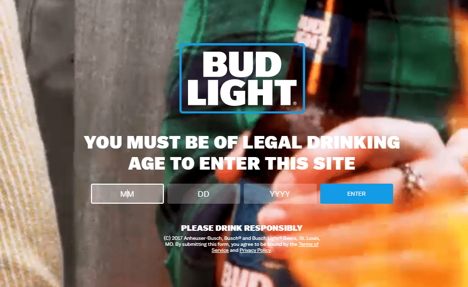


Splash pages used to be simple add-ons to a website to clarify basic information.
They could determine the preferred language of the user, ask if they wanted to install flash or other programs to make the site run smoother, or tell the user to turn on sound for videos.
But now, splash pages are a whole new game. People like Taron from KNOXLABS are using them to generate real pre-orders for their products.
You can even use them to give preliminary offers and lead magnets.
Check out how Conversion Gods use splash pages on their website and blog to provide offers and get people to convert before even landing on their homepage:
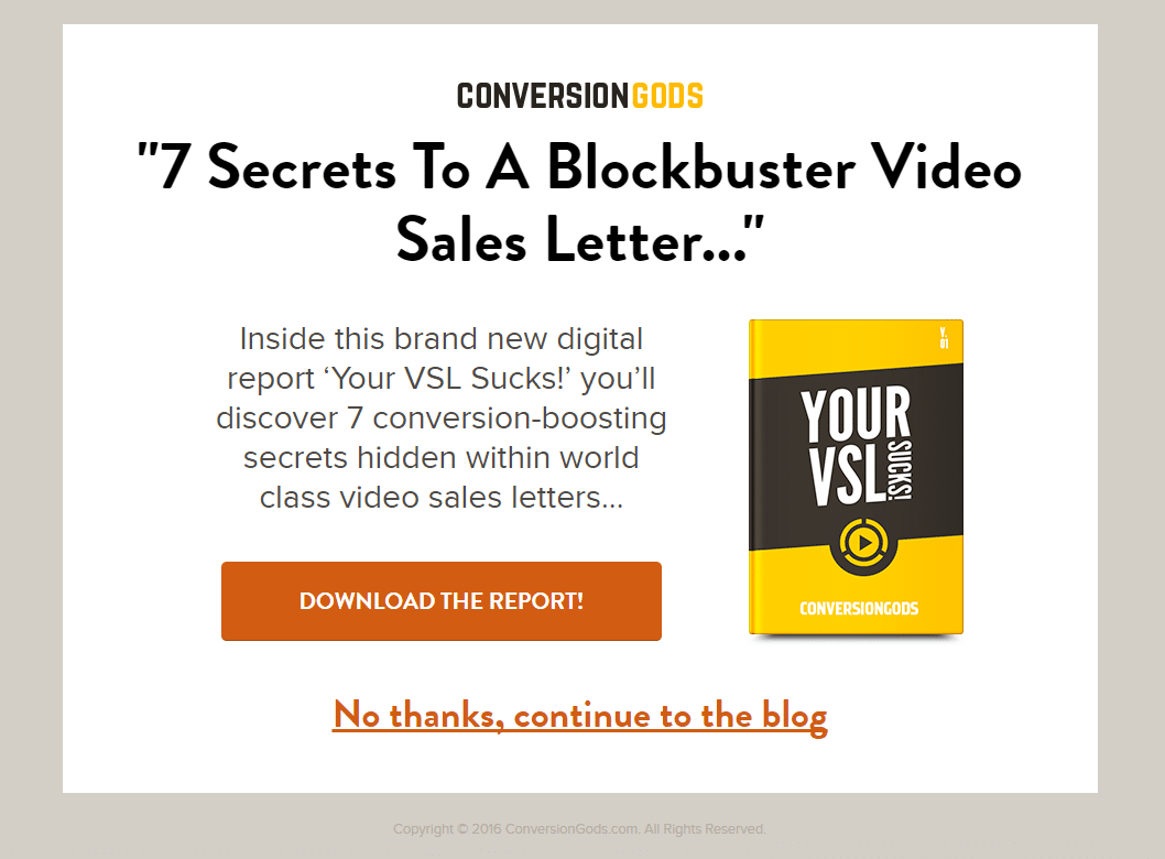


Another amazing example of a successful splash page comes from Football.com. Look at how they filter traffic and tailor the user experience based on your decision:
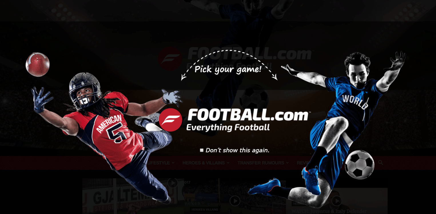


If you select American Football (on the left), your user experience will be vastly different than if you choose “soccer” on the right.
So, what’s the difference between a splash page and the typical homepage?
A splash page is located on your homepage as a type of welcome screen.
Rather than focusing completely on your business, a splash page has a few elements and is often highly specific to an offer, product, or something that your business caters to.
Homepages typically have navigational links and menus, while a splash page only directs the user to click a link or click out of it.
With that being said, what are you supposed to include on a splash page when it comes to product validation?
Here’s a list to get you started:
- A concise message about your product/service that can be summed up in one simple sentence
- A clear-cut call to action
- A way to exit the splash page back to your homepage
Now that you know how splash pages work, it’s time to learn how KNOXLABS tested the VR market using a splash page. Then you’ll see how you can implement their plan on your site.
How KNOXLABS tested the VR market with a splash page
Taron Lizagub founded KNOXLABS in 2015 in Los Angeles, California.
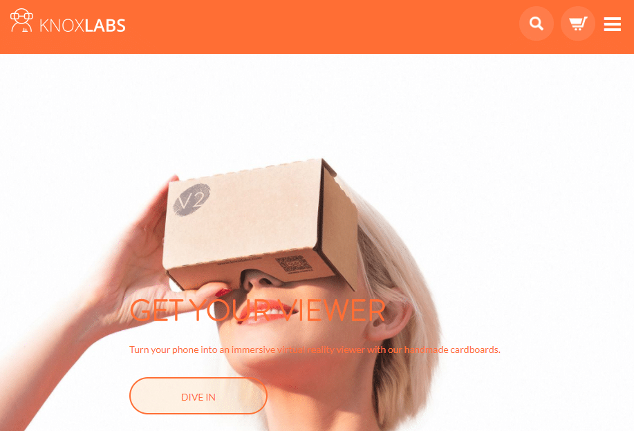


The company sells virtual reality-based products that help users turn their smartphones into a cheap virtual-reality machine.
Instead of buying hundred dollar headsets, you can purchase a cardboard-based virtual reality add-on for your smartphone for only a few bucks.
They manufacture mobile headsets that are coupled with a mobile app to turn your phone into a 360-degree virtual world.
KNOXLABS uses special lenses and technology to make a VR product that anyone can afford.
The company was born in 2014 after Taron watched the Google I/O keynote where they unveiled a cardboard-based virtually reality idea. It was called “Google Cardboard.”


With this new, revolutionary technology, Taron had a feeling that he could make money producing these products for cheap.
But he had no idea how the reception of the market would be.
Would people actually want to buy the product or have any interest in using a funky cardboard box to play games on their phones?
The idea seemed revolutionary but almost impractical.
Taron had a background in engineering and design, and he knew that he could make this product work.
He just needed to know if there was a willingness from users to spend their hard-earned money on it.
He decided to test the market before diving head first into product development. To test the waters, he created a simple website with a splash page that focused on driving pre-order signups.
And within a week he had over 500 people pre-order. They were willing to pay for his product that wasn’t even developed or beta tested yet.
He successfully generated enough interest and hype in his product to confirm his idea without having to spend thousands of dollars on beta tests.
And now Taron sells multiple products on his site that range from the basic VR headset to a full-scale kit:
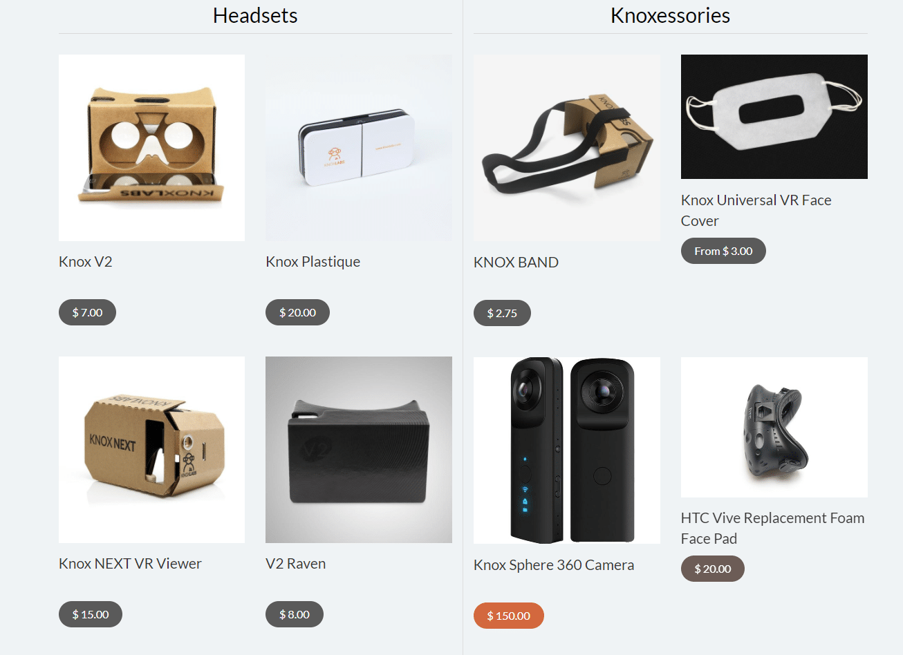


Taron is now earning millions of dollars a year in revenue on his website.
And it all started with the birth of an idea and inspiration from Google with the minimalistic testing of a splash page.
Splash pages can be extremely useful for any business to begin collecting pre-orders.
They are a great way to capture user attention fast and get them to click to a specific landing page.
Taron used this splash page strategy to light the fire for his business and give him the validation he needed.
Here’s how you can validate your product and drive pre-order sales with a splash page.
How to validate your product and drive pre-orders with a splash page
Validating your product in today’s world usually takes capital investments.
It’s hard to know if people are going to want to buy your product when it’s not even developed.
Thankfully, with a splash page, you can attempt to gain interest without a full-scale test that can cost thousands of dollars.
You can skip production and go straight for the pre-orders.
Here’s how to start validating your product to drive more sales.
Step 1: Develop your offer
The first step before creating a splash page involves creating your product offer.
You need to know how to create a compelling product description and offer that will appeal to people.
Even if you have the greatest product of all time, if you can’t communicate the value, you risk losing out on sales.
And there’s no way to validate your product without a compelling reason for people to sit up and take notice.
To get some ideas, let’s take another look at the splash page that Conversion Gods uses:
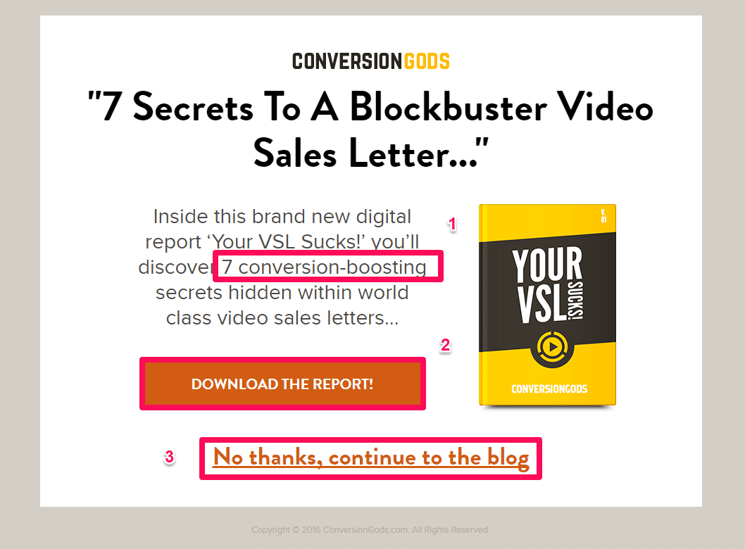


Some of the key components in building your offer and communicating value are:
- Explaining how the product will help or benefit them. What end-value will they get by opting in? For example, in this report, they’d get the value of conversion-boosting trade secrets.
- A clear-cut call to action. In this example, it’s Download The Report! A clear call to action helps direct traffic to your offer and stands out from the copy and design.
- Give the user a way to opt out of the offer without any consequences while keeping them on your site.
To create an offer that gets people to take notice, follow these tips.
Start by writing down what your product does. For example:
My product can help you ___, ___, and ___.
Next, you need to communicate in clear, concise writing how this product can improve the lives of your potential customers.
For example, try using this template:
Using this product you will get ___, ___ and ___. Fill in the blanks with tangible benefits like “saves you time” or “cuts costs.”
Once you’ve nailed down these basic components, consider what your call to action button will say.
When it comes to a CTA, you want to be clear and concise while delivering personalized value.
Don’t simply write “download now.” Try using something that feels personal to the user. For example:
I Want To Pre-Order Now.
You can see a great example of a value-driven call to action button throughout HubSpot’s site. Here’s their prime example:
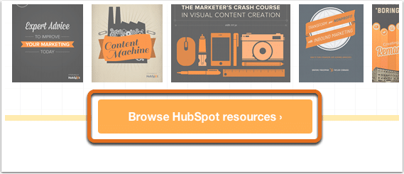


Make sure to show that by clicking the call to action, the user will get exactly what they expect.
Don’t use clickbait and don’t trick the user into clicking. Be honest and upfront while still delivering the promised product in a clever way.
Now that you’ve developed the base offer for your validation splash page, it’s time to work on the creative.
Step 2: Design your creative
Creative is one of the most important aspects of a splash page.
Visual aids are crucial when it comes to content marketing and marketing in general. Think about the last time you browsed your way through an ecommerce store.
Were there pictures and videos on the site showing the products? Did it make you think about how you could use those products?
Surely they did. Ecommerce sites need to make users feel connected to the products, and images do just that.
Why do sites utilize a visual strategy? Because we process almost everything in our lives in a visual manner.
For example, 90% of the information sent to the brain is visual, and 93% of all human interaction is visually-centered.


And this works in practice for marketing, too. Pages with images or video draw 94% more views than pages with only text.
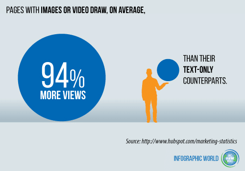


If you don’t have images on your splash page, your potential product doesn’t have a shot at being validated.
People need to see the product. Seeing is everything when it comes to validation.
If people can’t visualize how they’d use or interact with your product, they won’t pre-order it!
To get started, try using an image editing software like Canva. Create your free account and then select the following template:


The social graphic template is a good one to get started with because it’s close to the size of a splash page. That means you can fit all of your information on it.
Canva has some great, free templates too.
For example, check out this awesome, free template you can base your design off of:
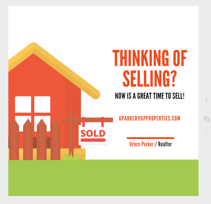


Once you are ready to start designing your creative, upload an image of your product:
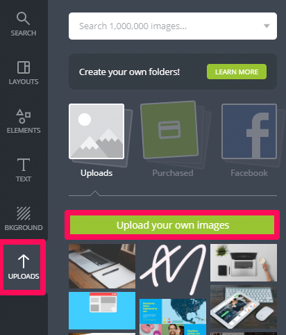


Navigate to the uploads section and upload your images.
If you don’t have a product made or beta tested just yet, you can still validate it using a mock-up design or stock photo.
Taron didn’t even have a product sketched for his splash page. He just used a stock photo of Google Cardboard directly from Google.
Meaning you can use almost any image or mock-up design to showcase your product.
If you need a design, you can always head to Fiverr and search for a mock-up/design artist:


Here’s one of the first ones we found while searching:
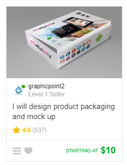


You can find cheap designers to help create a virtual design of your product idea, skipping the need to create real models that cost production money.
Get a mock-up of your ideas created for just a few bucks and then upload that photo straight into Canva.
To give you an idea of how easy it is, here is a splash page that we created in under five minutes for a product on Canva:
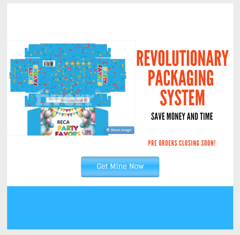


It’s simple, yet contains all of the needed aspects of a splash page:
- Product image
- Great headline
- Value proposition
- Call to action button that will direct back to a landing page to pre-order
You can add almost anything to your splash page using Canva as the design tool.
For example, you can add icons, graphs, and more using their elements tab:
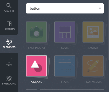


Be sure to get creative with your splash page design on Canva, and you’ll be on your way to validating your product in no time.
Once you complete a splash page design, it’s time to bring it to life.
Step 3: Use Instapage to bring it to life
Instapage is an SaaS product dedicated to helping companies produce better landing pages.
With their simple interface, you can create splash pages in just a few minutes that work perfectly with any site platform.
Instead of just landing pages, Instapage has diverse splash page features:
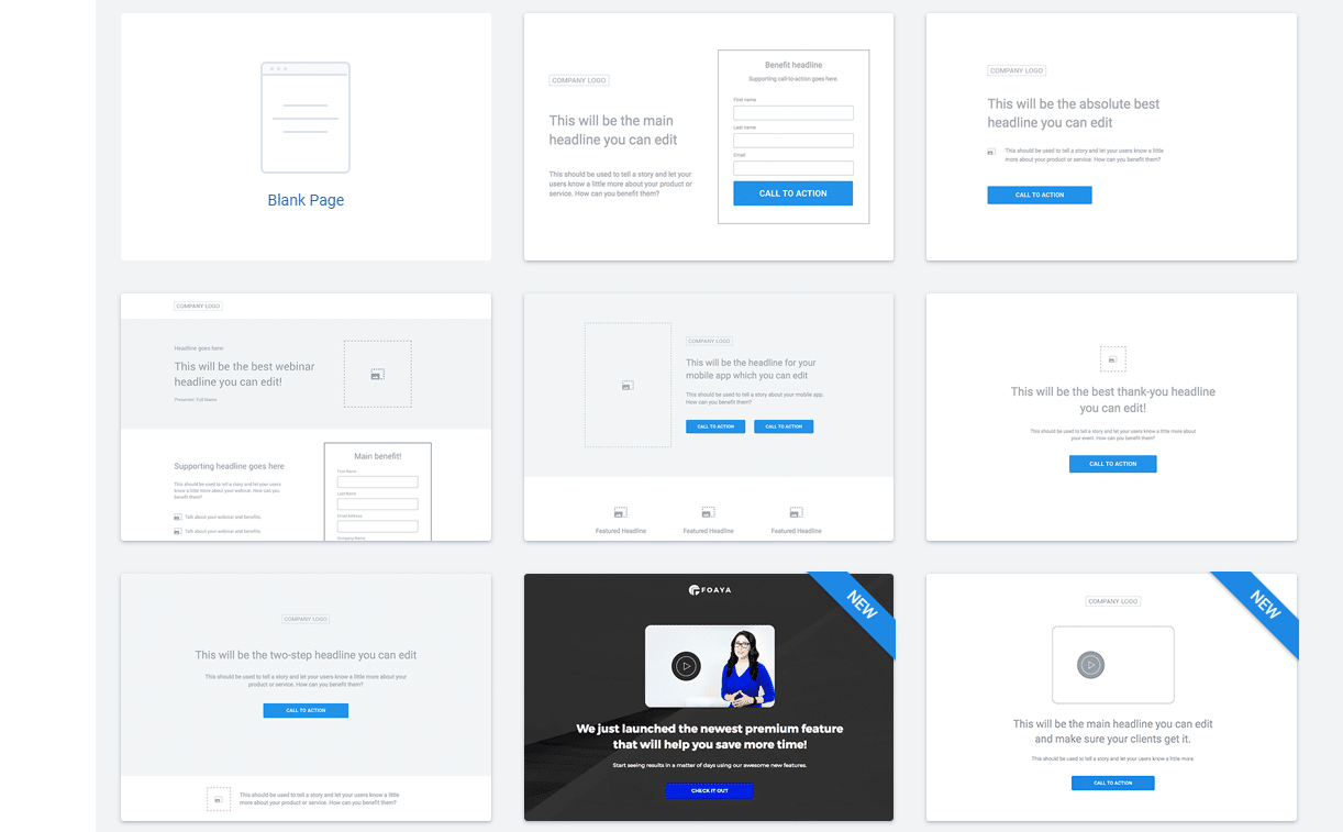


You can choose from dozens of templates that feature images, videos, and forms.
From the most complex to the simplest, you can create splash pages for your site customized to just about any goal.
To get started with Instapage, you can create a free trial account on their site without using a credit card.
Click “Get Started” from the homepage to create a free account:


Next, you can choose from dozens of templates for your splash page.
This template allows you to add a featured image for your product along with the headline and a specific call-to-action button:
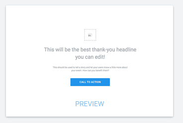


Click “Preview” to get started. From the preview you can see exactly what this splash page will look like before you decide to edit it:
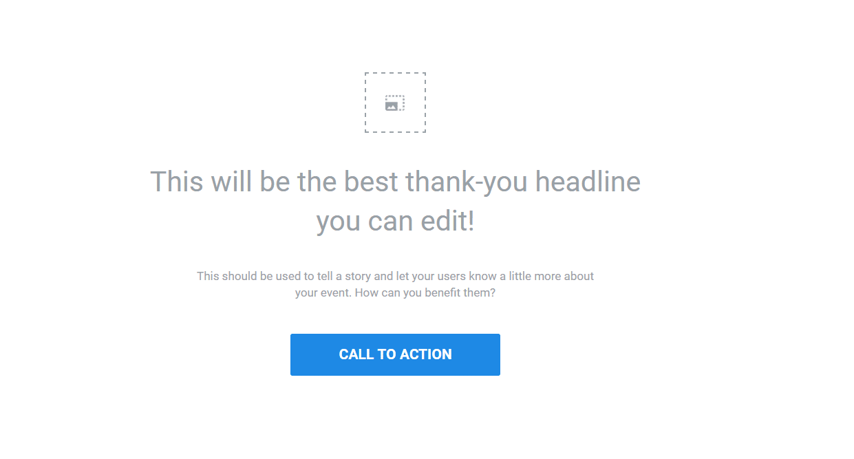


Remember that splash pages are best kept concise, simple, and clear.
This template is great because it looks exactly like the one you just designed on Canva.
To edit it, click “Edit Page” in the top right-hand corner:


From here you can upload your image and edit the headlines, subtext, and your call-to-action button.
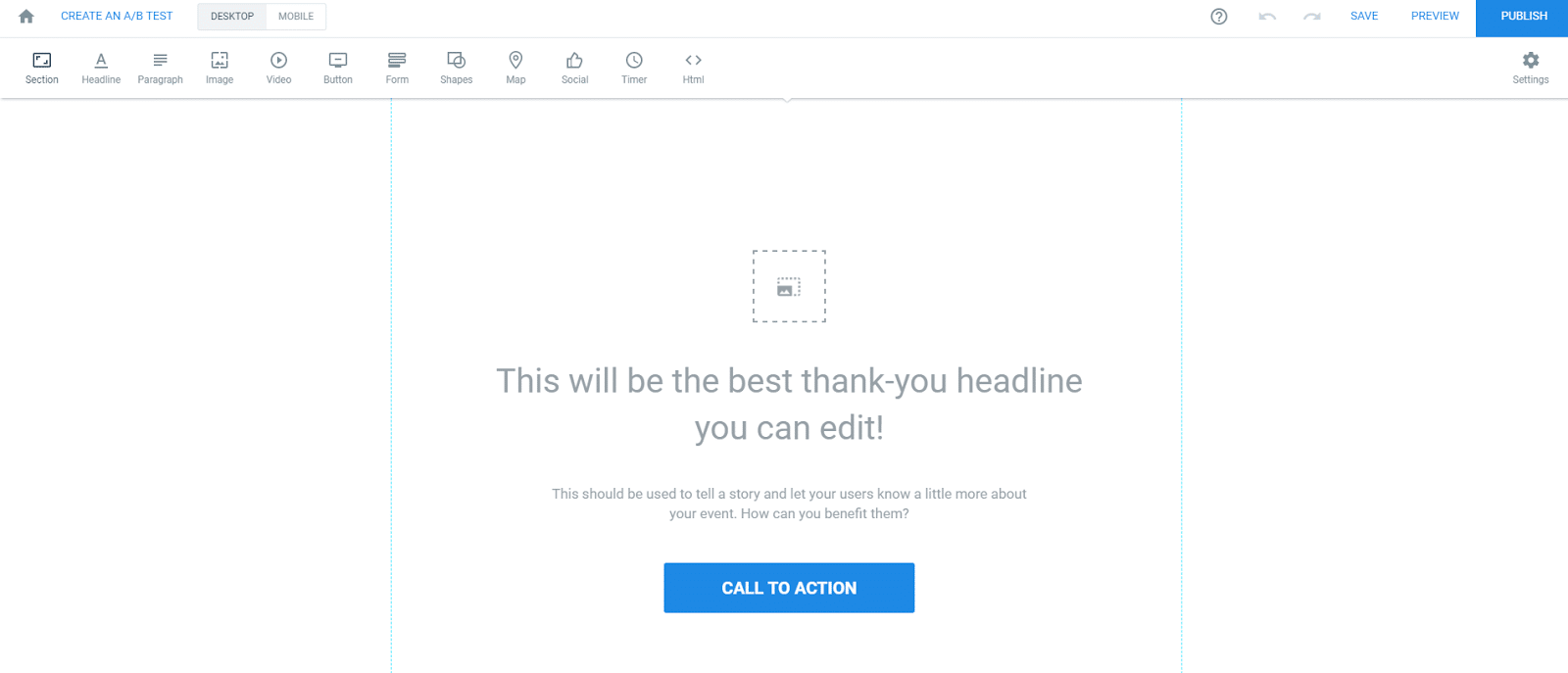


The simple drag-and-drop editor makes this program extremely easy to use.
To edit your call to action and direct it to a landing page, click on the call-to-action button:
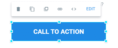


From here you can type to edit the text. Click the hyperlink button to direct the clicks to a landing page (which we will create in step 4).
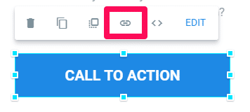


Now you can direct those clicks to an external link of your choosing.
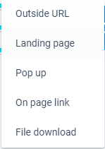
For example, an outside URL, landing page, or even a file download:


Instapage has tons of different features that can help you create urgency and drive pre-orders on your splash page, too.
One of the best ones they offer is the countdown timer:


You can create a countdown that will mark the end of your pre-order sales and drive even more conversions.
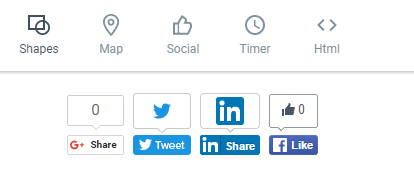
You can also add social profiles for users to check out your social media:


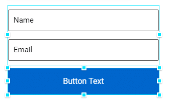
If you want to collect leads on your splash page for your product validation, you can also add a simple form:


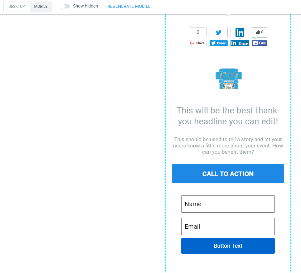
And Instapage will automatically optimize your splash page for mobile, too. Meaning you don’t have to do any extra legwork to get your page optimized:


Validating your product isn’t easy. Testing the market before spending money is almost impossible.
But integrating a splash page into the mix can help you see how much traction your product is getting in the eyes of real customers.
Once you’ve created a splash page, it’s time to develop a landing page to tie it all together.
This will be the page where interested users who have validated your ideas will land to finalize a pre-order.
Here’s how to get started.
Step 4: Create a landing page on Unbounce to seal the deal
Once you’ve created a splash page, you’ve done the bulk of the work.
Now, your goal for your splash page is to attract new visitors to your product or business idea.
It brings in traffic and can help you see if your product is producing intrigue.
While using that splash page, you need to get people to convert on a pre-order.
Taron used his splash page as a building block for his business and driving sales. It generated tons of interest and buzz around his idea.
He knew that to really validate his product he’d have to produce ROI-benefiting sales.
But, you can’t do that without a landing page for those pre-orders.
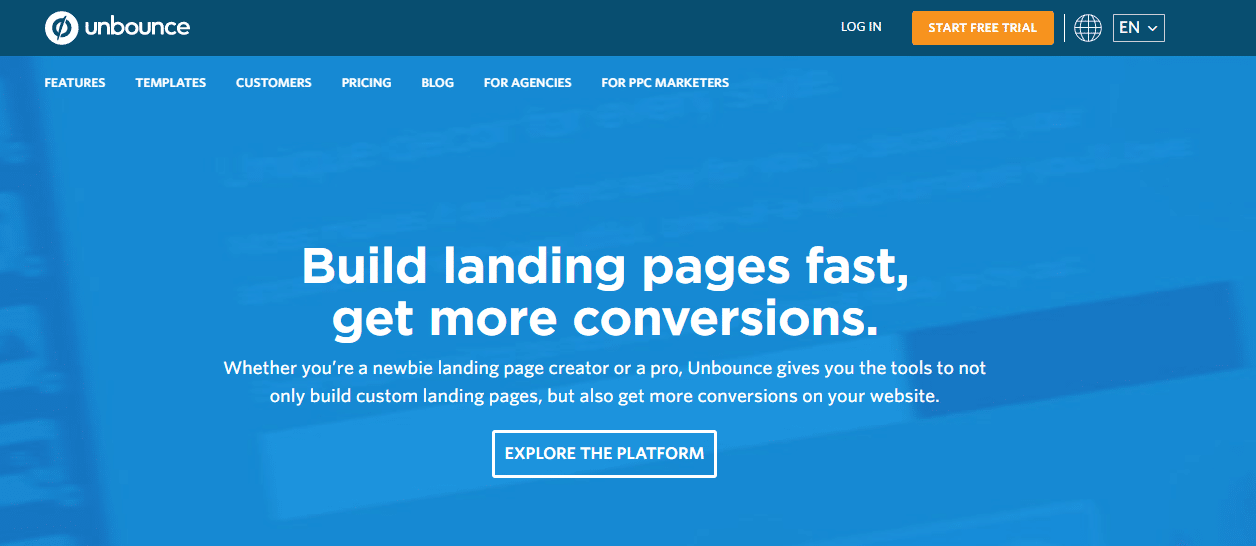
Unbounce is one of the best landing page softwares on the market when it comes to getting conversions.


Thousands of companies have used it to create high-quality landing pages that are designed for one thing:
Driving as many sales and conversions as possible in the least amount of time possible.
Instead of building pages on your Shopify account or WordPress site, you should be looking at outside tools and resources that are specifically designed for landing pages.
To get started with Unbounce and landing page development, click “Start Free Trial” or “Explore The Platform.”
Create a free account by linking your email. From here, you can choose from a bunch of different landing page templates.
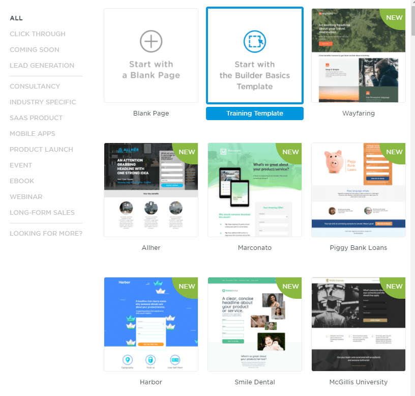


If you are validating your product with pre-orders, you can sort the landing page types by “Product Launch” or “Long-Form Sales.”
These will be templates specifically designed for the goals that fit your validation aspirations:
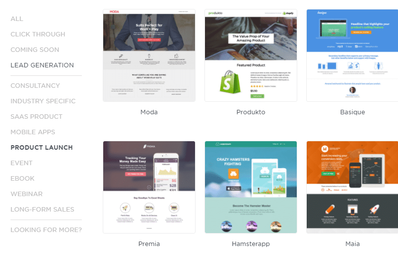


Grab a visually appealing template that you can modify with your product and start editing the content.
To upload your product mock-ups or demo shots, click on the image button in the left-hand menu:


Drag and drop that image icon onto your landing page, and then upload your desired photo.
Next, you can create a new button by dragging the button icon onto the page:


If you are familiar with custom HTML, you can add your own elements:


If you have a product video or demo-based video, you can easily link that via YouTube or any video-hosting website:


The options on Unbounce’s landing page builder are almost endless.
If you want to finish validating your product, you need to use that splash page to drive traffic to your landing page because that’s where you can close the deal.
You want to focus less on attention and product description and more on closing the sale.
Here’s what a finished landing page looks like with under two minutes of editing:
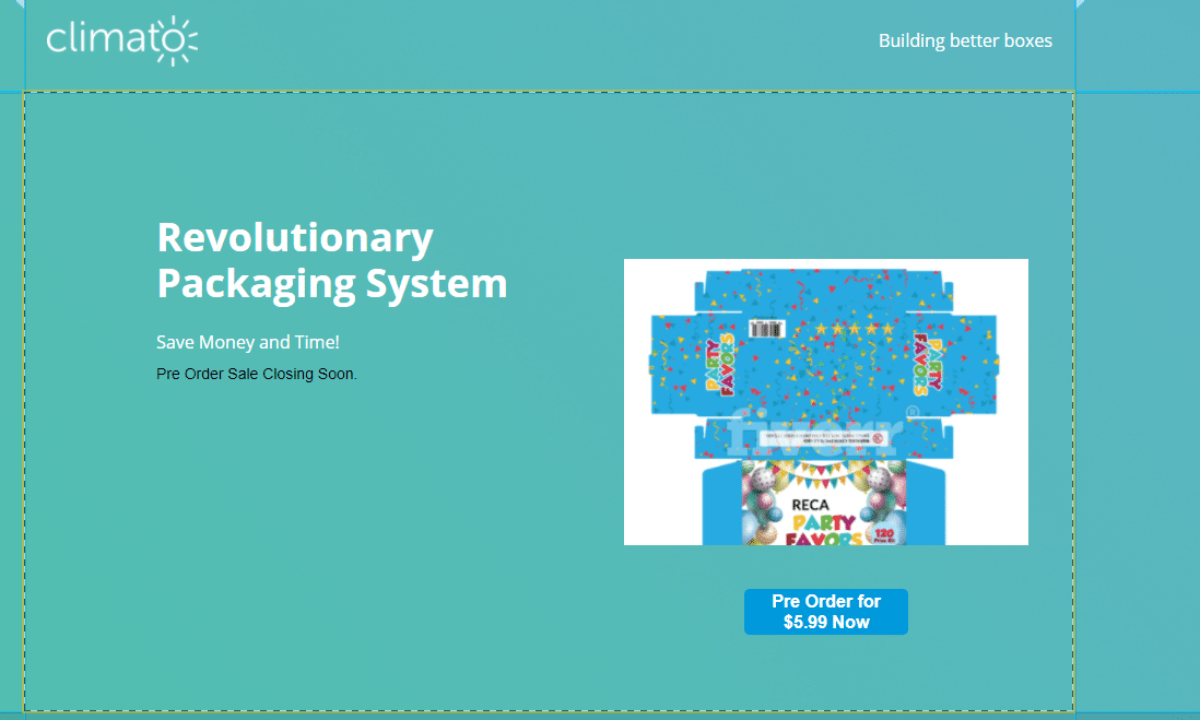


Landing pages combined with splash pages are what helped Taron drive hundreds of pre-orders before he even began developing his product.
If you want to test the market, try using his strategy that we’ve outlined.
Conclusion
Validating your business ideas before spending thousands of dollars on development is critical.
But it’s nearly impossible to do.
You just don’t know if people are going to love your product or not. And without that feedback and validation, you could be risking your financial future.
Starting production on a beta-testing product isn’t always a good idea.
Thankfully, there’s one proven method for testing your product’s reception:
Using splash pages to drive pre-orders on your landing page.
Follow in the footsteps of Taron from KNOXLABS to test your ideas and products before spending thousands of dollars on development.
Follow these steps, and you’ll be on track to create a validated product that already has orders pending.
What are some of the best ways you’ve validated your business? How do you prove that your product has demand?
Comments